Every December, the design world pauses for a moment of collective reflection as Pantone announces its Colour of the Year. The chosen hue is never just a trend. It is a temperature reading of the world around us; a distillation of the cultural, emotional, and creative landscape shaping the next chapter of design.
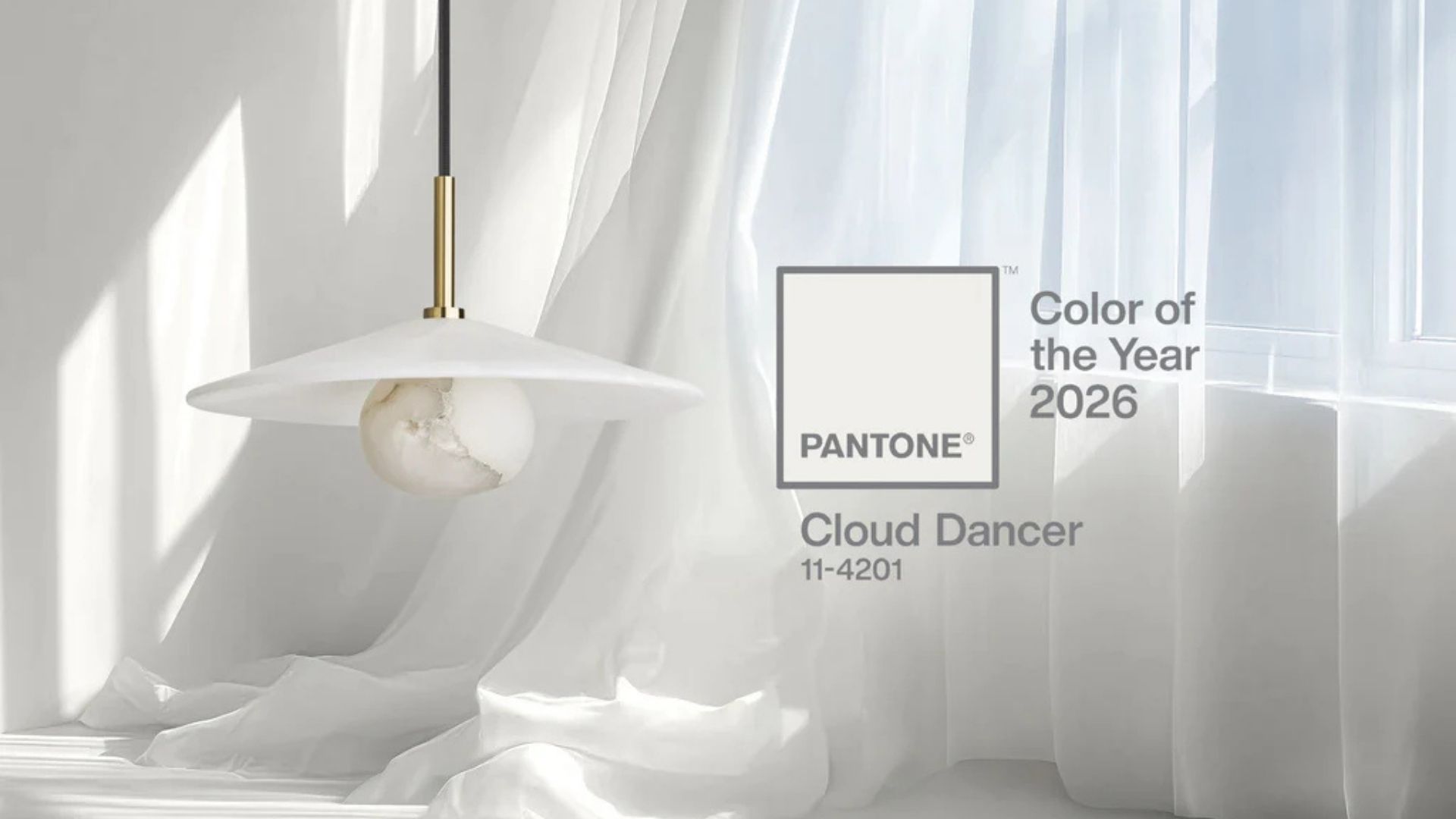
For 2026, that hue is PANTONE 11-4201 Cloud Dancer: a quiet, contemplative off-white that invites clarity, reflection and new avenues of creativity.
Pantone describes it as a space where ideas can break through; a colour grounded in purity yet open to possibility.
At Aspinall Marine, this sentiment resonates strongly. It is a tone chosen for its sense of fresh perspective, and future-facing energy. Cloud Dancer feels like a natural continuation of this journey: an invitation to rethink, to refine, and to design with intention.
For cruise interiors, its message could not be more timely.
Simplicity as Strength
Cloud Dancer sits at the intersection of simplicity and depth. At first glance, it appears neutral… but on closer inspection, it reveals a deliberate quietness.
This distinction is essential.
Simplicity is not the absence of design. It is the amplification of its purpose.
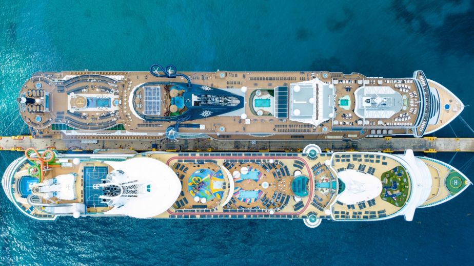
At sea, where visual environments can easily become saturated, this restraint is powerful. A refined palette offers guests a sense of ease, orientation, and clarity. Consider it a welcome relief from the intensity of large-scale hospitality and leisure spaces.
We believe cruise interiors will increasingly move in this direction: not toward minimalism, but toward precision. Spaces with a clear point of view. Colour applied not as a blanket, but as a sculpting tool. Tones selected not to impress at first glance, but to endure across long journeys.
Cloud Dancer embodies this philosophy. It demonstrates how a single, controlled shade can anchor an entire space with quiet confidence and absolute purpose.

Why Restraint Feels So Radical Right Now
Cruise design is often expected to be bold and theatrical, even flamboyant in some breaths. These spaces carry the weight of expectation. An expectation to entertain, to energise, to surprise.
Cloud Dancer is a reminder that boldness can take a different form.
To choose restraint is, in many ways, an act of rebellion in itself.
A space built on clarity, balance, and focused intentions can be just as iconic as one built on spectacle. Guests increasingly recognise authenticity; they respond to spaces where every element feels considered and nothing feels excessive.
This is where the industry is shifting. The most compelling cruise interiors will not be those with the most noise. Instead it will be those with the most vision.
For us, Cloud Dancer isn’t a whisper. It’s a statement.
Colour as Emotional Architecture
Life at sea is dynamic. Guests transition between rest and activity, between quiet horizon-watching and high-energy social spaces. Design must meet all those moods with sensitivity. Colour is one of the most powerful tools for shaping emotional experience.
Cloud Dancer, with its softened luminosity, encourages reflection. It encourages a feeling of breath, openness and creative possibility. It supports transitions. It provides a sense of grounding in environments that are constantly moving.
In a cruise context, this matters.
We believe it means:
- Suites that feel restorative rather than ornamental
- Restaurants that allow cuisine and conversation to take centre stage
- Lounges that shift elegantly between day and night
- Arrival spaces that feel welcoming, not overwhelming
Colour is not ornamentation. It is atmosphere. It is behaviour. It is memory.
Cloud Dancer is a reminder that some of the strongest emotions come from the subtlest design gestures.

A Fresh Perspective for the Industry
When we founded Aspinall Marine, we did so with a belief in the power of clarity; in celebrating potential rather than repeating precedent. Cloud Dancer captures this beautifully. It is a colour rooted in reflection, but not passivity. It suggests momentum, evolution and refinement.
In a sector as established as cruise design, this is meaningful.
It prompts us to ask:
- What happens when we remove the unnecessary?
- What becomes possible when we design with purpose?
- What if the most iconic spaces are defined not by their volume, but by their vision?
The Colour of the Year does not tell us what to create, instead it invites us to rethink how we create.
Looking Ahead to 2026
As we continue developing concepts for the next generation of cruise interiors, Cloud Dancer offers both direction and affirmation. It reinforces our belief that the future of design at sea lies in emotional intelligence, intentionality, and above all else – a clear sense of identity.
We see the coming years as an opportunity to redefine boldness and to shift from spectacle to sophistication, from noise to nuance, and from decoration to meaning.
The lesson of Pantone’s Cloud Dancer is simple and profound:
You don’t need to be loud to lead.
For us we believe that at sea, where every detail carries weight, that clarity is transformative.